Microsoft 365 Chooser Test
I led UX design for the Microsoft 365 SKU Chooser redesign — simplifying an overwhelming comparison experience for millions of users. Over several months, I collaborated with a content designer along with marketing, engineering, and leadership teams to reduce cognitive load and boost KPIs by more than 10x previous page redesign tests. The page was fast-tracked to be built and launched by engineering permanently.
The challenge
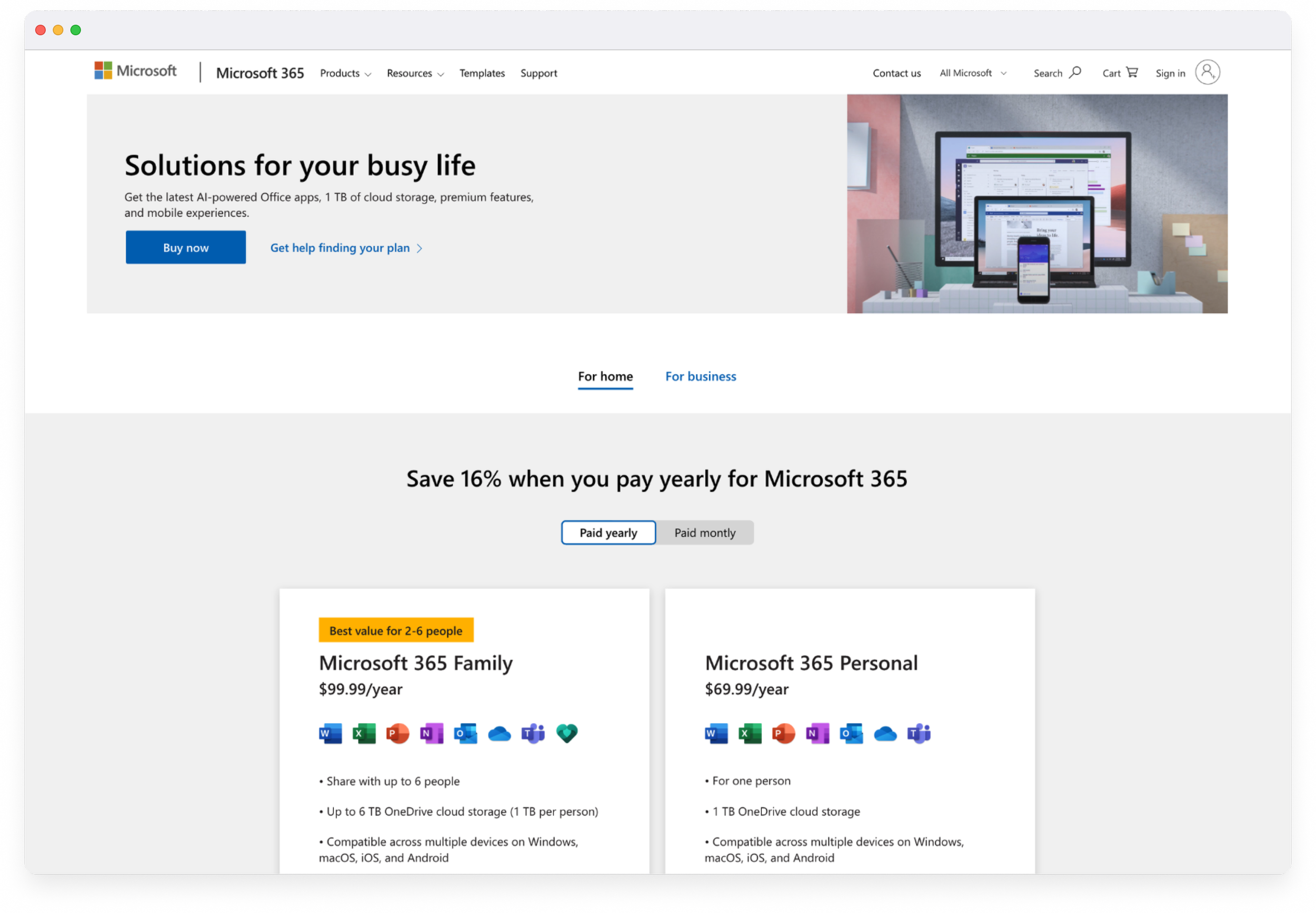
The original chooser page was packed with information, competing CTAs, and multiple feature tables — making it difficult for users to find what they needed or understand the difference in plans.
Pain points:
Overwhelming visual clutter
No clear action for users
High bounce rates and low conversions
Stakeholders wanted “everything above the fold”
Goal: Create a simplified, guided chooser that helped users confidently pick the right plan — while balancing business needs for visibility and scalability.
Understanding the problem
The content designer and I collaborated closely with the UX research and marketing teams to thoroughly review past usability tests, heat maps, detailed customer interviews, and comprehensive competitor analysis. Through this evaluation, we discovered that users highly value clear and straightforward plan details, prefer app features that facilitate easy recognition, and favor simpler, more intuitive visuals and CTAs.
Ideation & explorations

Since the project included multiple scenarios and future expansion paths, we began by presenting a broad range of options for stakeholder review. From there, we refined the experience to stay clear, familiar, and focused on exactly what customers need to compare.
Key considerations:
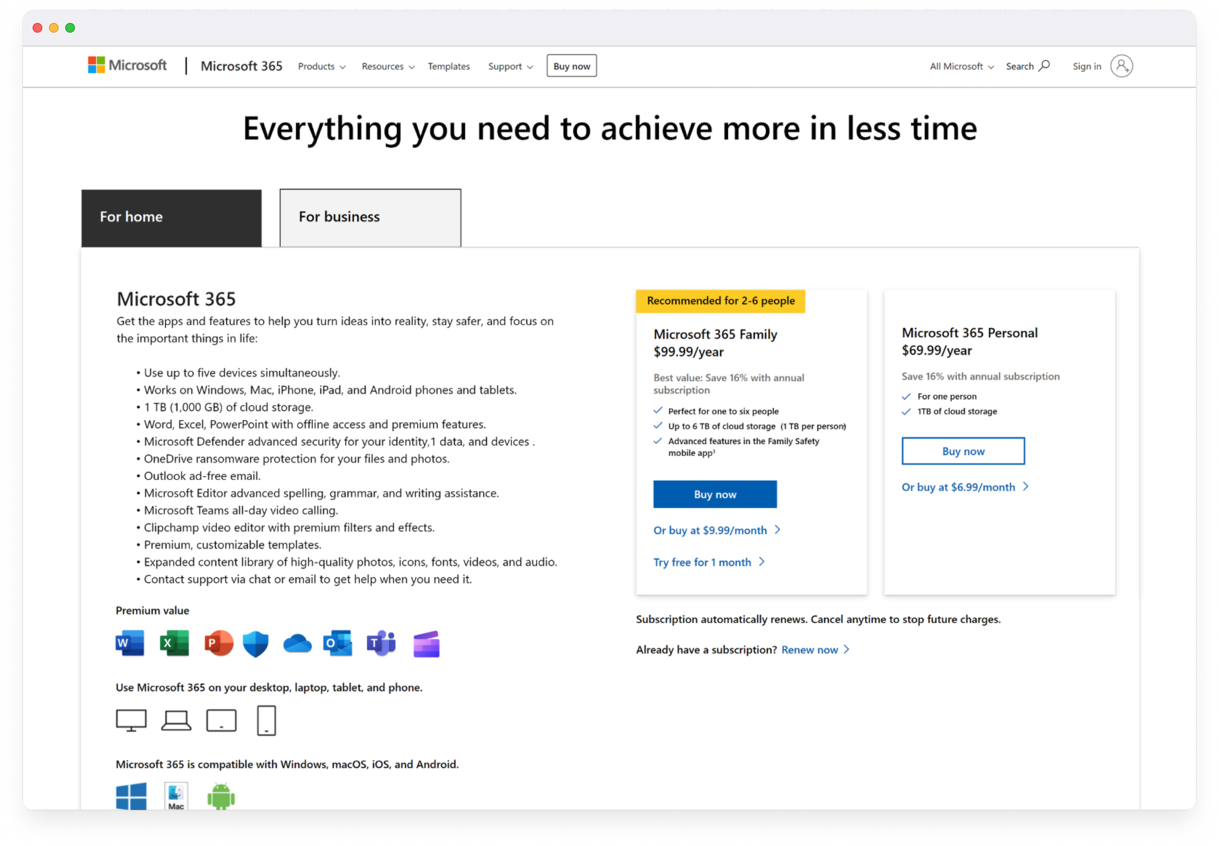
Reduced above-the-fold content from 8 points of focus to 4 core components to minimize cognitive load
Evaluated whether a more visual hero added value or if a streamlined, information-first layout was more effective
Introduced a “tab within a tab” structure to clearly separate Home vs. Business, then Monthly vs. Yearly within the Home tab
Tightened copy and rewrote headlines to be benefit-driven
Added scannable comparison cards to efficiently highlight differences between the Family and Personal plans
Testing & iterating for clarity
We reviewed designs internally with stakeholders, then tested clickable prototypes on desktop and mobile with customers.
Key takeaways:
✅ Users found the new layout “much easier to scan and find information.” ✅ Cards improved self-selection confidence.
✅ Copy clarity improved understanding of “Family” vs “Personal.”
Based on testing feedback, we refined copy, adjusted card spacing, and improved mobile stacking behavior.
A simplified experience
The new design introduced clear hierarchy and breathing room, focused CTAs guiding decision-making, and consistent visual structure for all screen sizes.
The updated experience delivered a 10x improvement in KPIs compared to previous test run by the Microsoft 365 team, reduced bounce rates by 40%, and made plan selection 30% faster for customers. The design was ultimately adopted as the layout template for additional Microsoft product pages, extending its impact across the ecosystem.
Previous design

Final design

What I learned …
This project reinforced the power of clarity in complex decision-making. Early stakeholder alignment and iterative testing were key to success.
If I could revisit this project:
Conduct formal usability testing earlier in the project
Explore adaptive or personalized plan recommendations, possibly implementing a “Help me choose”
As always in any project, have more time for research and testing to really dig into issues deeper
Balancing the diverse expectations of stakeholders with maintaining user trust while ensuring clear understanding is one of the most significant challenges faced in UX design.